Making Complex UI Components in Figma


Making Complex UI Components in Figma
Components are pieces of UI elements that can be reused across the design. Apart from maintaining consistency in the design, a complex figma component offers the ability to create states using interactive components feature.
Figma offers a variety of features that I have been utilizing to create complex yet flexible components. In this blog post, I'll go through a sidebar component that I made for ClickPesa's admin dashboard to show my approach to making complex components in Figma.

Structure and components
I like to use the atomic design approach while making components in Figma. For example the sidebar I mentioned I'd treat it like an organism, the sidebar-item-groups as molecules, and the sidebar-items and sidebar-title as atoms.
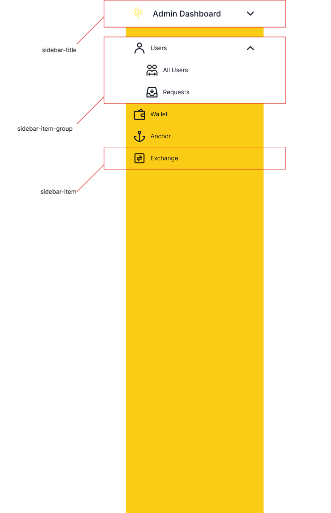
The sidebar-item component
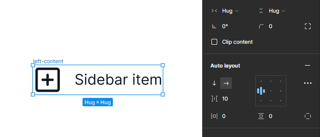
This component consists of two icon components and one text layer. I combined the left icon and the text layer into one frame with an auto layout set to center-left alignment and width of hug content. This will provide the flexibility I need if I ever remove the icon the text will just snap to the left and the hug content width will ensure that the text will always have as much room to the right as the frame container will allow. I’ll also name the frame left-content.
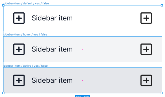
I then framed together the left-content frame with the other icon and add auto layout set to space-between or auto center, a width of 250px, and horizontal padding of 15 and vertical padding of 10. Now, I want this component to have three properties; state property which has three values: default, hover, and active, right icon property whose values are just yes or no, and inner sidebar property whose values are either true or false. Using slash-separated naming convention Figma will automatically group instances together, create properties and assign them values.
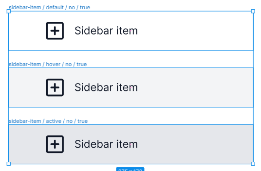
So I named the frame sidebar-item / default / yes / false so later Figma can create three properties and pass those names as values to each property starting at “default”. I then duplicated the frame and added a light grey fill and named it sidebar-item / hover / yes / false. I made another duplicate and this time I increased the grey value a little bit and named it sidebar-item / active / yes / false. The end result looks something like this:
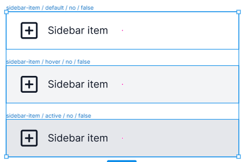
I duplicated all three frames, removed the left icon and set auto layout to left-center. I then renamed the frames’ “/ yes” to “/ no”. The end result looks like this:
I then duplicated the above frames, detached the padding to independent paddings, assign padding left to 40, and then renamed the frames’ “/ false” to “/ true”. The end result looks like this:
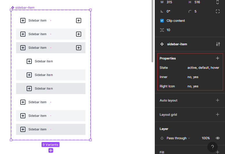
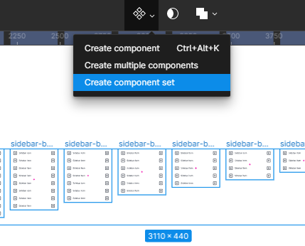
I finally selected all the nine variations, click the component dropdown icon at the top center menu in Figma and I selected “Create component set”, which create a component with three properties. On the left panel, the properties have been assigned default names of property 1, 2, and 3 so I’ll rename them to State, Inner, and Right Icon respectively. See the image
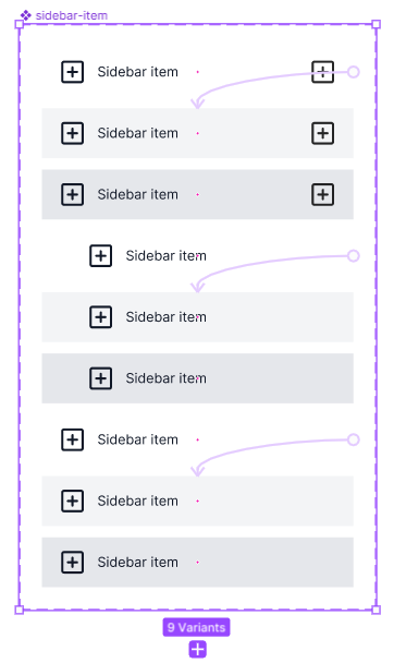
The last thing is to make this component interactive. So, I switched to prototype mode and added a hover interaction to all default variant to change to hover variants on-hover. See the image
The sidebar-body component
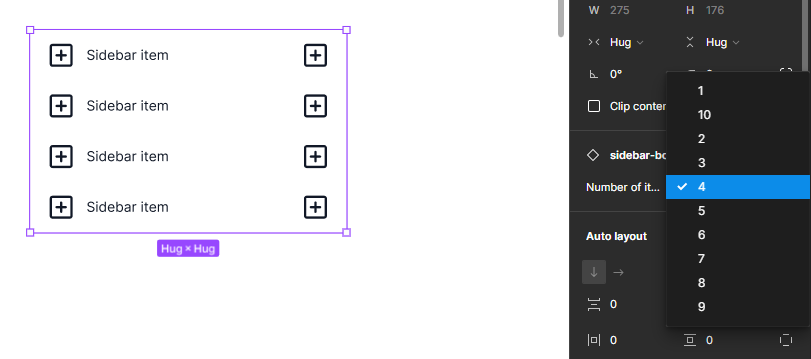
In figma, once you create a component with certain number of children or nested components, you wont be able to add more children in an instance and that’s where most of us decide to detach an instance and live life freely until the product manager request changes and now you have to edit 20+ elements individually. To avoid that, I created a body component that houses sidebar-item components ranging between 1 and 10.
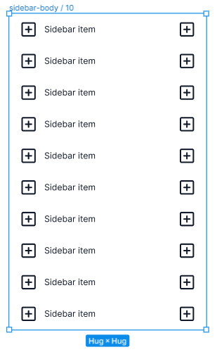
I got an instance of sidebar-item from my assets, duplicated it 10 times, selected all 10 instance, framed them with auto layout set to center-center and width and height set to hug content, and then named the frame sidebar-body / 10. I then duplicated it nine more times and decremented the amount of sidebar-items and the number in the name by one on each duplicate. The results looks like this:
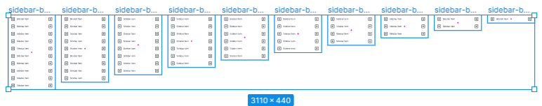
I finally selected all ten variations, click the component dropdown icon at the top center menu in Figma and I selected “Create component set”, and renamed the property to “Number of items”.
With this component, I’ll always be able to increase number of sidebar-items anywhere without having to detach my instances.
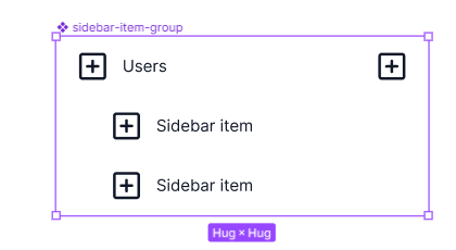
The sidebar-item-group component
Some of the sidebar items will have inner items, so I need this component to be able to open and close them. This component consists of a sidebar-item and sidebar-item-body components. The sidebar-body component has 2 items for now. The steps I used to create this component is as follow; selected all needed instances > framed them > added auto layout set to center-center > set width and height to hug > rename the frame to sidebar-item-group > Ctrl + Alt + K (create component shortcut in windows).
The sidebar-title component
This component consists of three elements, the logo component, text layer, and icon component. And the reason I use components its so later its easy to swap the logo or the icon with something else. The logo component and text layer are framed together with an auto layout set to left-center, width set to hug, fill of white, and frame renamed to left-content. The left-content frame is then framed together with the right icon with auto layout of center-center and width set to hug.
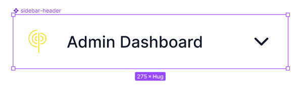
I suppose I could have used the sidebar-item component but I have other plans in the future with this component that are outside the scope of this sprint so for now, this will do.
The sidebar component
This has two components, the sidebar-title and the sidebar-body component. For now the sidebar-body has four items. I then framed the two together, and this time without auto layout just fixed width of 275 and height of 1024. I placed a 20px gap between the sidebar-title and sidebar-body instances. I also added a fill of yellow.
Adding state to sidebar-item-group
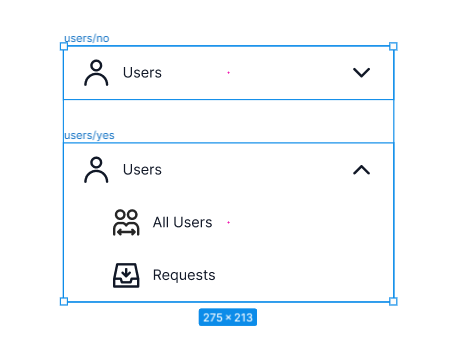
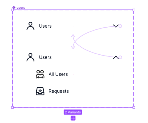
I want the sidebar items to have open and close states and be activated when someone clicks in the prototype and also have the inner items link to specific pages. I can’t achieve the later because you can’t pass prototype links for every instance of a component. So what I decided to do is creating a component for each sidebar item that need inner items that way I can achieve both of my requirements.
So this consists of two instances of the sidebar-item-group component. On one instance has no inner items and icon on the right is chevron-down. The other instance has inner items and right icon is chevron-up.
Naming will depend with the name on the item. Example, for item user, I’ll name the component user / no and user / yes; yes and no being values of property open.
I’ll then select both instances and create a component (Ctrl + Alt + K ). Using prototype mode, I’ll add a click interaction to both instances that will point to each other.
Conclusion
Creating components in Figma has been a trial and error process. I made a couple of mistakes before that cost me a lot of time to fix. Important lessons I have learned is to properly structure my components and being willing to do the tedious work because its going to save a lot of time in the future.