Creating a design system from scratch
This is the third and final part in my series about my notes on the design system, you can find the introduction part here and the second part here. In the first part, I talked about design systems, and in the second part, I talked about customizing a prebuilt design system. In this article, I’ll go over some things that I and my team at ClickPesa did to successfully ship our custom design system.
1. The Scope
The first thing to do when creating a design system is to determine the primary usage of your system. You might want your design system to be a general system that designers and teams building different products can use or you might want it to be something specific to only your projects or narrow it down even more to a single project. The wider the target usage of your system, the broader the scope.
The scope of your system will determine how many colors and text styles you will have to set up and how many components and their variants you will have to create. Let’s say you want to create a design system like Untitled UI that designers and teams can buy and use in their own projects, in this case, you will have to consider the needs of a lot of designers and create a general solution that will be a time server and yet customizable enough to fit into their products. You might end up creating and maintaining hundreds of components with their variants.
Another case is if you want to create a design system for your products or for a single product. In this case, you will only have to set up colors and text styles that are needed and create only the components that your products use. At ClickPesa, we decided to ship a design system that can be used to design all of our products. We decided that our products will share components and only use different primary colors and font families so I only created components that we need for our products with a few variants. This makes it easy to use and maintain the design system.
2. Creating the system
Intro
The team and I dedicated two days and went over our products to determine what components do we need to design, then we prepared a list in google sheets with six columns; name, type, description, states, variants, and URL to component. This document serves as documentation, a rule book, and also a design system checklist. We chose to use google sheet so that every member of the team can have access to it and take a look whenever they want to.
Design Tokens
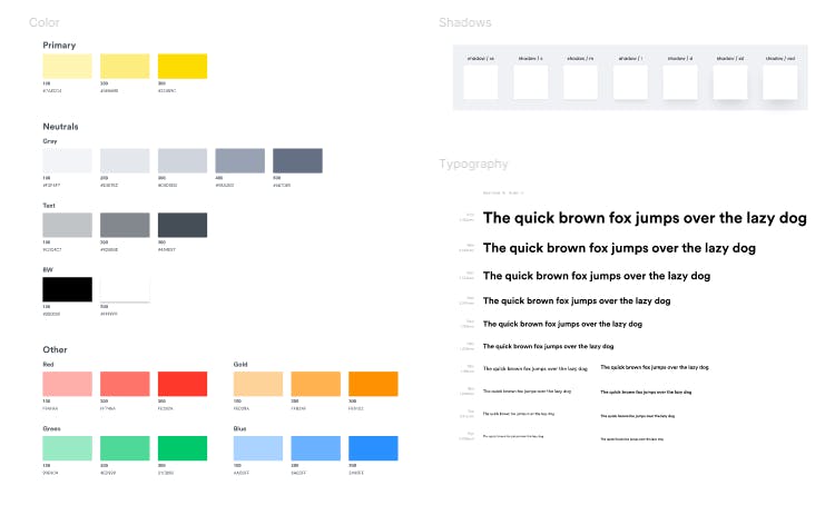
I started by preparing the design tokens. I only prepared colors, text styles, drop shadows, and border-radius. So far those are the only things we needed in our products.

Icons
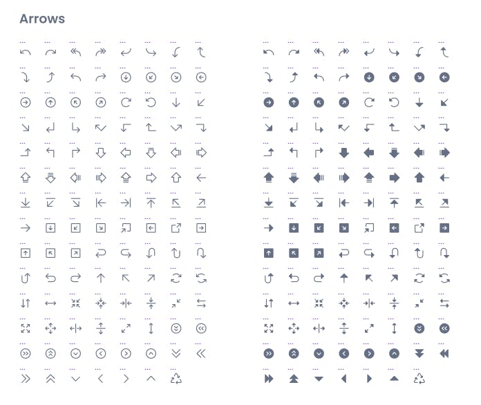
After setting up all the tokens, I prepared the icons. I used Phosphor icons and migrated outlined and filled icons to my design system.

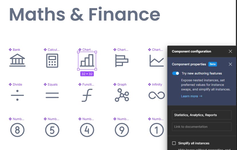
I also added common keywords that I’d use to search certain icons in their description so it’s easy to find them.

Components
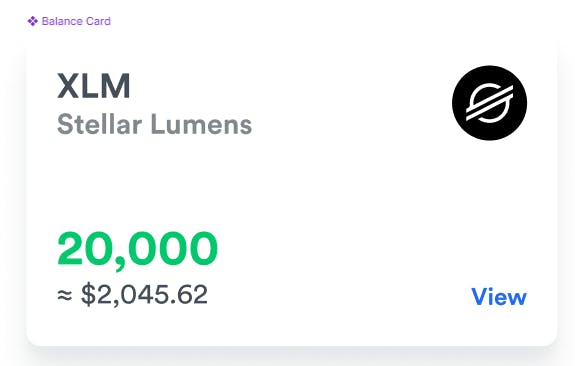
For ClickPesa we decided on 33 components that are going to be used in all our products including GetPaid. We have essential components such as input, textarea, buttons, and other product-specific components such as the balance card component that we use to display account balances.

If you are interested to learn about my process of creating complex components in Figma, I wrote an article about it here.
3. Documentation
Apart from having a google sheet with a description of what each component is and where to use it, I also prepared documentation in Figma that goes into specifics on how to use the component.
Conclusion
If your product is huge, creating a design system from scratch can seem daunting, but it's an important investment for any company that wants to create consistent, efficient, and memorable products. Just start small and evolve it according to usage needs.