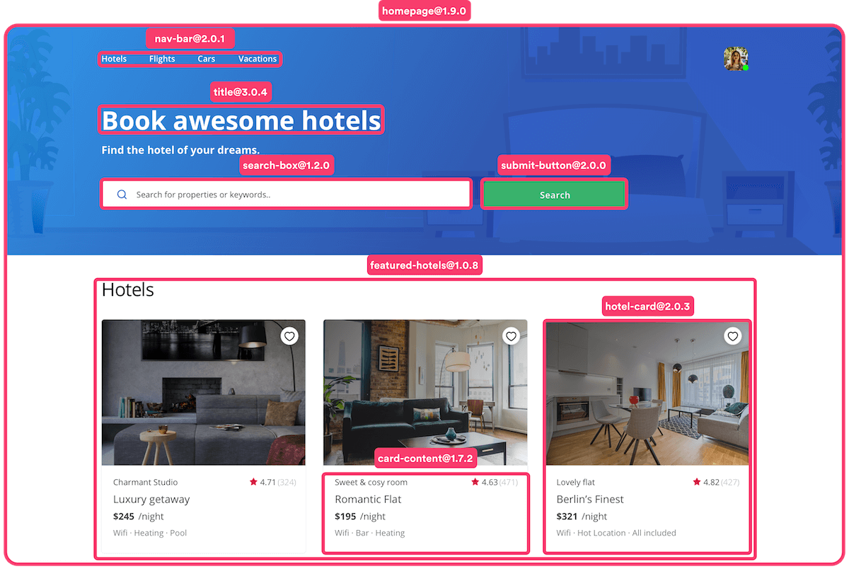
React is one of the most popular JavaScript libraries for building user interfaces. One of the key benefits of React is its component-based architecture, which allows developers to create reusable UI components that can be shared across different projects.
Bit.dev is a platform that makes it easy to create and share React components.

There are several reasons why someone might need to use Bit.dev for their React components:
Reusability: Bit.dev allows developers to create and share reusable components across different projects and teams. This can greatly reduce development time and ensure consistency across projects.
Collaboration: Bit.dev provides tools for testing, versioning, and collaboration, making it easy for teams to work together on component development. This can help to improve code quality and reduce errors.
Scalability: Bit.dev is a distributed and scalable platform that can handle large-scale component-based development workflows. It provides a flexible and customizable workflow that can be adapted to the specific needs of different projects and teams.
Open-source community: Bit.dev has a thriving open-source community that contributes to the platform and creates new components. This can be a great resource for developers looking for inspiration or looking to contribute to open-source projects.
Integration: Bit.dev can integrate with other tools and platforms, such as Git and CI/CD pipelines, to create a seamless development workflow. This can help to streamline development processes and improve overall efficiency.
In this article, I'll walk you through the steps to create and deploy React components with Bit.dev.
To start creating components using bit, first we need to create accounts on bit.cloud.
Step 1: From the bit.cloud dashboard, create a scope, a place where you will be deploying your components.
Step 2: Install bit on your machine by following this set of commands
First install bvm
npm i -g @teambit/bvm
To verify that bvm is installed, run
bvm --version
if no bvm command is not found, follow this instructions
Step 3: Initialize your components project Create new workspace by running
bit new react tasks-workspace --default-scope my-org.tasks-scope
Where:-
tasks-workspace: Workspace name
my-org: Organization / username
tasks-scope: default scope for the new components.
This by default will create a new workspace with components as a default scope.
Step 4: Create your first component.
To create your first component, cd tasks-workspace run
bit create react button
This will create a button component within components folder. The created component will have a the following files
index.ts: Entry component file.
button.sx: Boiler plate for creating component.
button.spec.tsx: A file to write tests.
button.docs.mdx: A documentation file.
button.composition.tsx: A file for testing different variations of the component per creator's choice.
Run bit start to start the development server. Once the server is ready, on the browser, we should see this UI.
click on button component to open live preview of the created component.

Start editing the button component and preview changes on the browser.
In the component folder you can create multiple files such as stylesheet files, components files to support the main component. For now lets just make a button component work.
import React, { ReactNode } from 'react';

export type ButtonProps = {
  /**
   * a node to be rendered in the special component.
   */
  children?: ReactNode;
  /**
   * Onclick event
   */
  onClick?: () => void
};

export function Button({ children, onClick }: ButtonProps) {
  return (
    <button onClick={onClick}>
      {children}
    </button>
  );
}
Let's create two more components, title and input to complete a form with title, inputs and a button.
run
bit create react input
and
bit create react title
On title.tsx file in title folder add this code
import React, { ReactNode } from 'react';

export type TitleProps = {
  /**
   * a node to be rendered in the special component.
   */
  children?: ReactNode;
};

export function Title({ children }: TitleProps) {
  return <h1>{children}</h1>;
}
and on input.tsx in input folder add this code
import React, { CSSProperties, ChangeEvent } from 'react';

export type InputProps = {
  /**
   * label text
   */
  label: string;
  /**
   * input id
   */
  id?: string;
  /**
   * input type
   */
  type?: string;
  /**
   * on input change
   */
  onChange: (value: ChangeEvent<HTMLInputElement>) => void;
  /**
   * input value
   */
  value: string;
  /**
   * input style style
   */
  style?: CSSProperties;
};

export function Input({ label, id, type, onChange, value, style }: InputProps) {
  return (
    <label>
      <div>{label}</div>
      <input
        id={id}
        style={style}
        onChange={onChange}
        value={value}
        type={type}
      />
    </label>
  );
}
and on the input.composition.tsx add
import React, { useState } from 'react';
import { Input } from './input';

export const BasicInput = () => {
  const [value, setValue] = useState('');
  return (
    <Input
      label="Email"
      type="email"
      onChange={(e) => setValue(e.target.value)}
      value={value}
    />
  );
};
Update the docs and test on the live preview.
Step 5: Add test on the components. bit uses jest under the hood to run react tests. Learn more about react testing here
Step 5: Use created components within your components project before deployment.
With bit, we can import other components within our components without deploying the library. how? From the above created components, let's create a form component, call it login component which will include email and password inputs, submit button and title.
Run
bit create react login
and on login.tsx
import React, { useState } from 'react';
import { Input } from '@tasks-scope/components.input';
import { Title } from '@tasks-scope/components.title';
import { Button } from '@tasks-scope/components.button';

export type LoginProps = {
  onSubmit: (data: { email: string; password: string }) => void;
};

export function Login({ onSubmit }: LoginProps) {
  const [data, setData] = useState({
    email: '',
    password: '',
  });
  return (
    <form
      onSubmit={(e) => {
        e.preventDefault();
        onSubmit(data);
      }}
    >
      <Title>Welcome Back</Title>
      <Input
        value={data.email}
        onChange={(e) =>
          setData({
            ...data,
            email: e.target.value,
          })
        }
        label="Email"
      />
      <Input
        value={data.password}
        onChange={(e) =>
          setData({
            ...data,
            password: e.target.value,
          })
        }
        label="Password"
      />
      <Button>Submit</Button>
    </form>
  );
}
Now we have a working form component built with three other components.
Step 6: Install packages
There will be times that you will want to create a component but that component will need an external package to work, for instance one might need a styled-components package to create a component.
Run
bit install styled-components
This way one can use this package in any component they are creating
Step 7: Deploy your components
To deploy your library you need to login to bit cli,
run
bit login
This will open the browser and give you access to deploy your library.
Before deploying we need to tag all our components. Tagging components assigns new versions to our components. run
bit tag
In .bitmap, we should see the new versions assigned to our new components.
To deploy the components, run
bit export
This will deploy your new component library.
To view your fresh components visit bit.cloud/your-username/tasks-workspace.
For an existing workspace when you want to edit your components or creating new components, first you will need to import all deployed components by running
bit import
And after making all changes, use the same process as we did while deploying components.
Step 8: Install and use your deployed components on your react project.
In your react project, install your components and start using them.
the first time you are installing your components in your project, you will need to configure your bit organization or username first by running
npm config set '@your-username:registry' https://node.bit.cloud
After the configuration you won't need to do that again in your projects.
Then run
npm i @your-username/components.login
Then you can start using your components as you used them in the composition files in your bit components.
Congratulations!!
Creating and deploying React components with Bit.dev is a powerful way to streamline your development workflow and make your components reusable across different projects. By following the steps outlined in this article, you can easily create, test, and share React components with other developers using the Bit.dev platform.
If you like this article, there are more like this in our blogs, follow us on dev.to/clickpesa, medium.com/clickpesa-engineering-blog and clickpesa.hashnode.dev
Happy Hacking!!
